ZeusRH Web Platform

ZeusRH Web Platform

Web Design • Illustrations • UX Flows

Logo_Zeus3

The challenge

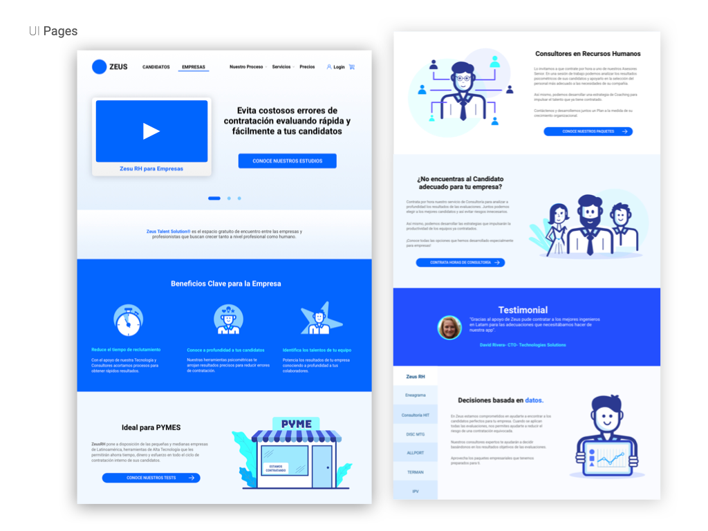
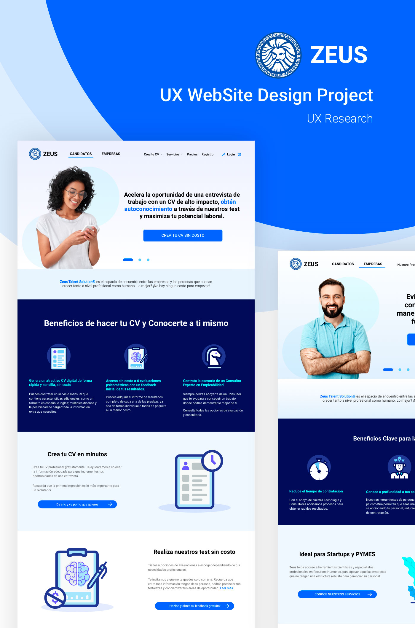
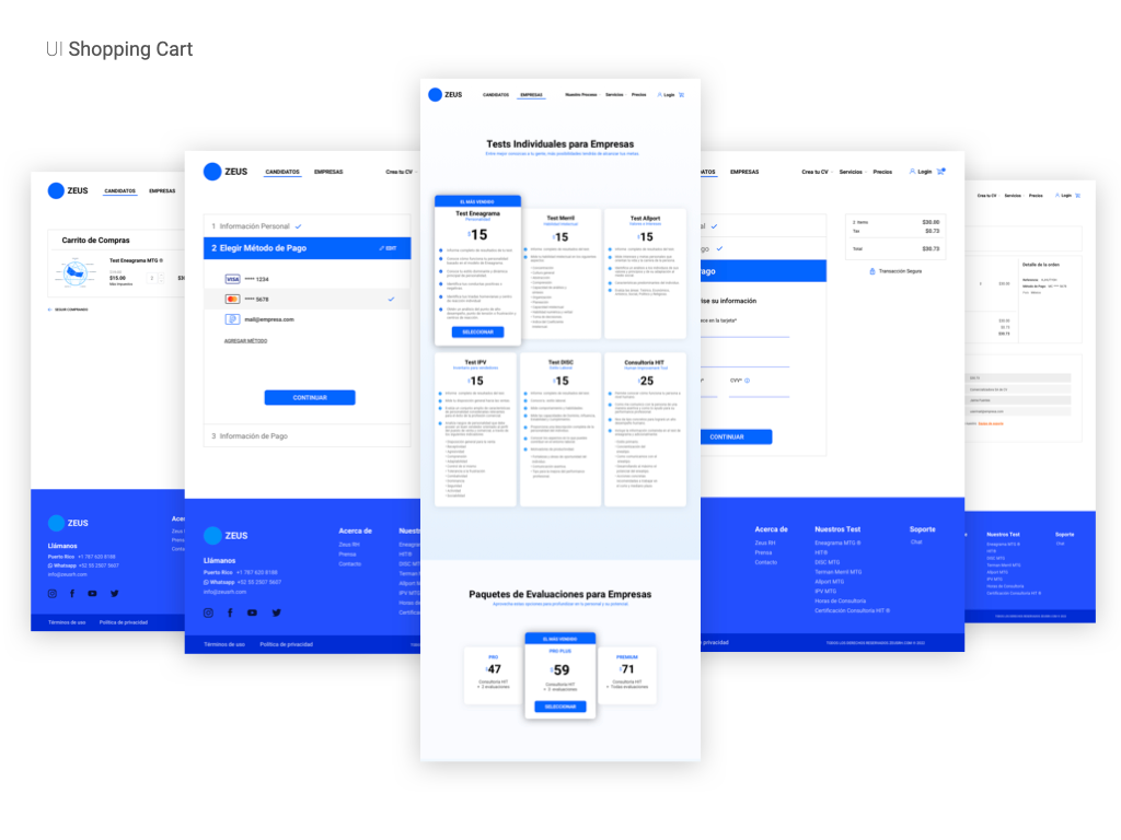
From the day we had the chance to review this recruiting platform, one thing became clear: it needed not only a fresh new design, but also a complete user experience.

The challenge was to understand the different types of users and design something clear and useful for them to find a new job easily and effortlessly.

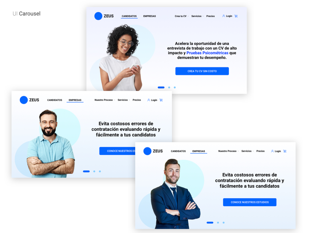
To do so, the OrangeStudio team reviewed it and came up with different user experiences. Although everyone is a candidate, not everyone is looking for the same thing. We had the young man looking for his first job, then the 30-year-old looking for a new, higher-paying job, and finally the 45-year-old looking for an executive position.

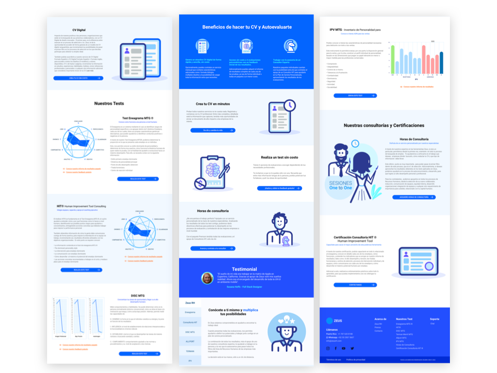
Having the specific information for each type of candidate, showing them a video that explains in 1 minute how ZeusRh works and having a quick verification process was key to the success of the project.
The process

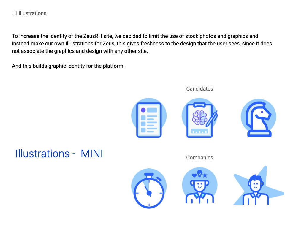
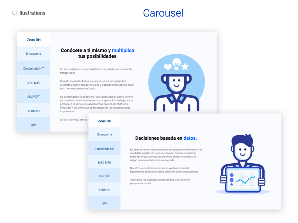
At OrangeStudio we wanted to create something unique that better identifies the platform and differentiates it from the rest. So we were working on original illustrations for the graphics and explanatory processes.

Design

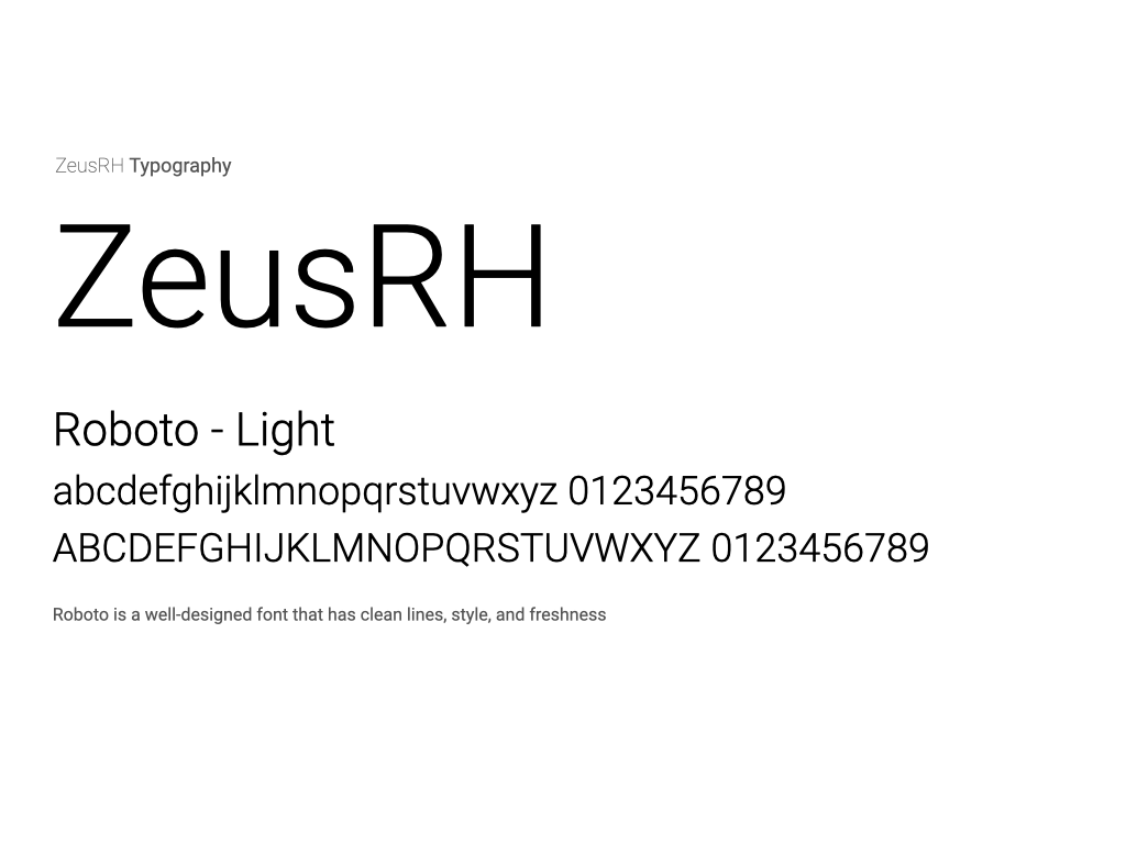
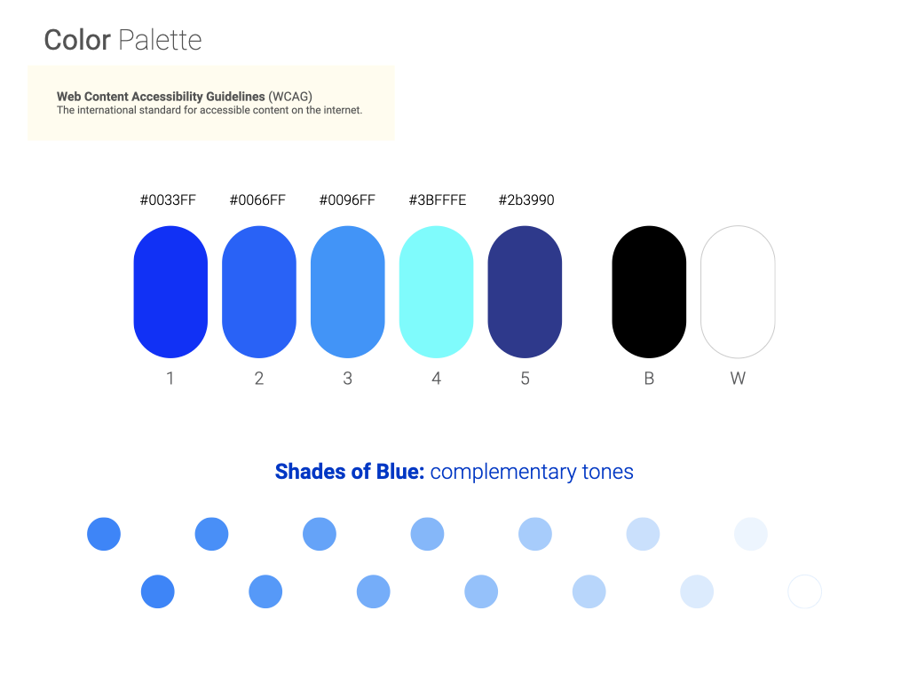
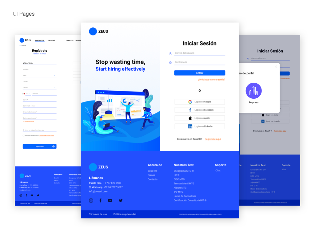
We worked with a blue color palette early on, then added cyan and light purple to accentuate the color scheme, navy blue and an almost black dark blue worked really well for the titles.

Redesigned Black & White
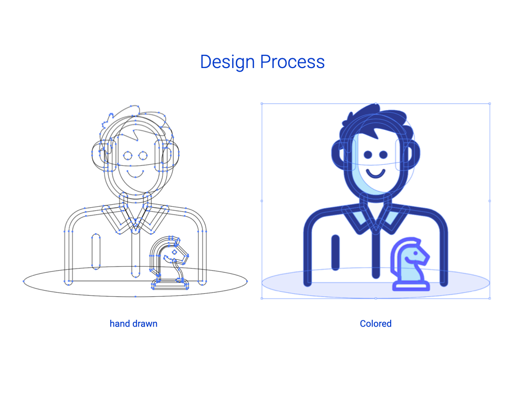
Redesigned Color

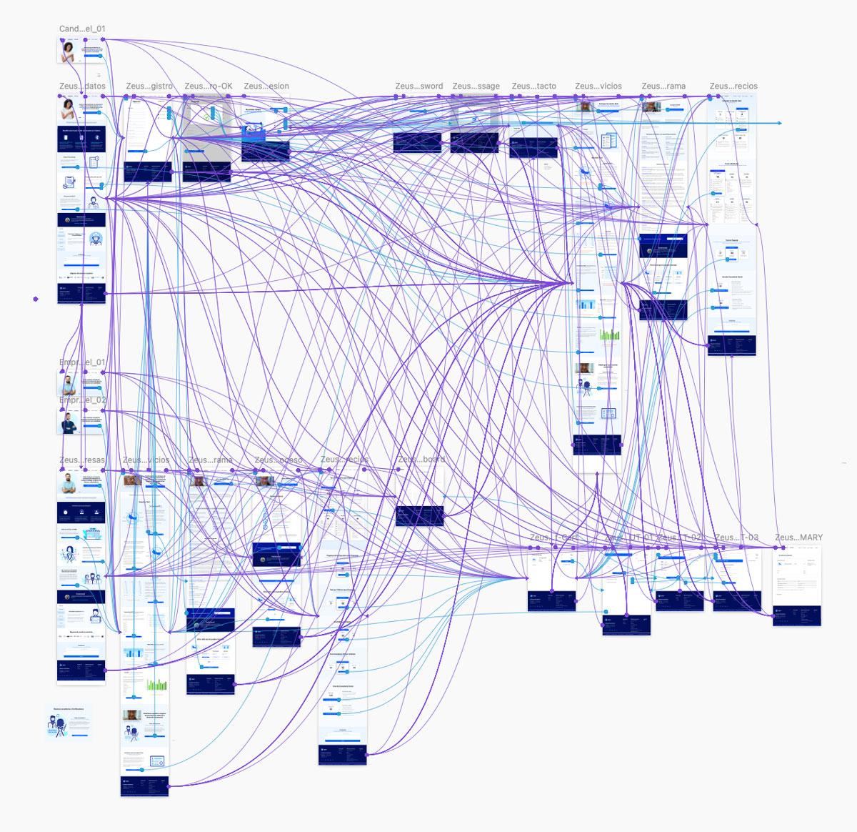
Focused on UX, user journeys were thoroughly explored and tested.
“The challenge for OrangeStudio was to refresh the branding by giving their designs a new fresh aspect focusing mainly on the users"
Let's talk about your proyect

Get in touch with us and schedule a zoom meeting
Ravent Food

Ravent Food

Branding • Illustration • Graphic Asset Design

Ravent-Food-logo

The challenge

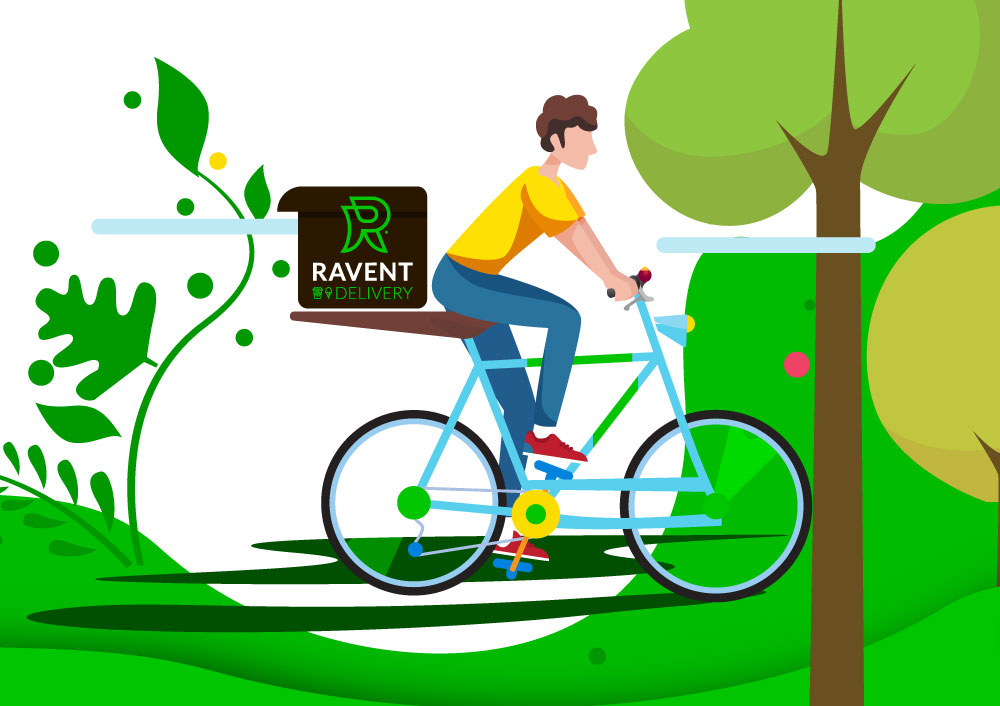
In the bustling urban sprawl of Berlin, a city teeming with culinary delights and enthusiastic customers, the challenge was clear: design and develop a delivery service that would stand out in an already crowded market. Enter ‘Crow Food’.

From the beginning, our primary goal was to create a brand that was not only fresh but also distinctively different from what current competitors offered. The journey began with the conceptualization of the Ravent brand. We envisioned a brand identity that would encapsulate the spirit of Berlin: vibrant, contemporary and always on the move.

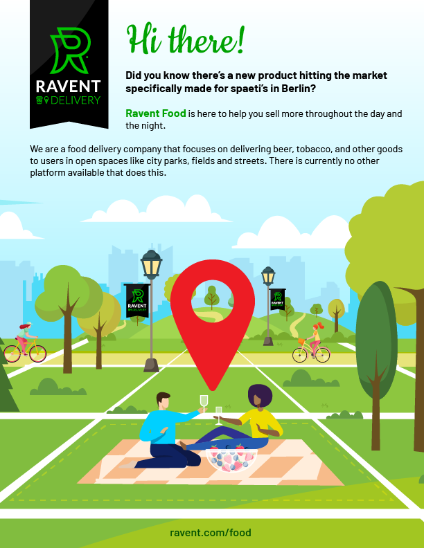
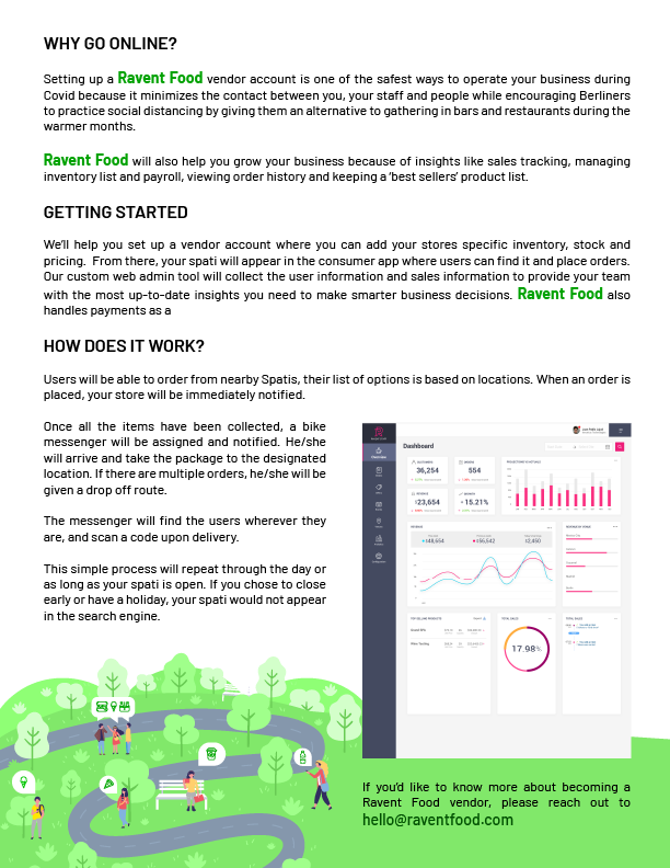
The graphic assets were meticulously designed to be emblematic of this spirit. Every asset, from app icons to promotional banners, was created to resonate with the target audience and establish an immediate connection. This foundation laid the groundwork for a broader visual identity, ensuring that every visual touch point—on the website, app, or even the delivery package—was cohesively integrated under the Ravent umbrella.

Ravent Food brand is not just another delivery service. It was a brand with a voice, personality and, most importantly, a promise: to offer the best of Berlin everywhere.

“Ravent Food brand is not just another delivery service. It was a brand with a voice, personality and, most importantly, a promise: to offer the best of Berlin everywhere.”

RaventFood-badge

Fella

Fella

Branding • Graphic Design • Merch

‎Fella.‎000

The challenge

The challenge for OrangeStudio was to create a teen brand that expressed friendship and freshness.”

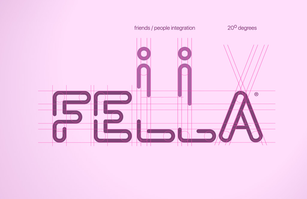
The first step was the exploration of the letter F, which would be the one that would give shape and dynamism to our brand.

Once selected, we started working on the selection of the color palette, it had to be cozy and soft. having determined both things, we dedicated ourselves in the study to the integration of the “friends” element to the logo, resulting in an interesting representation of the meaning of friendship.

Started with F letter exploration

The process

The process was first to visualize the two modes, both the dark mode for everything that is the informative site and the light mode for the announcements and news blog.

Design

The illustrations, on the other hand, were worked to represent each of the pages of the informative site, all of them were drawn digitally exclusively for the project.

F letter selection

“The challenge for OrangeStudio was to create a teenage brand that expressed friendship and freshness”​

Merch

Let's talk about your proyect

Get in touch with us and schedule a zoom meeting