In 1994 the first CaféCaffe branch was opened and it was immediately recognized as one of the best Gourmet coffee establishments in Mexico.
Its concept is the Coffee Bar, where you can taste various modalities, also counting on the sale of coffee beans, as well as imported items to be used at home.
The challenge for OrangeStudio was to restructure the branding to give the brand freshness and drive to help it face new challenges.
Below we explain in detail the analysis we developed for this project that was implemented in all ADO bus terminals in the southeast of the country.
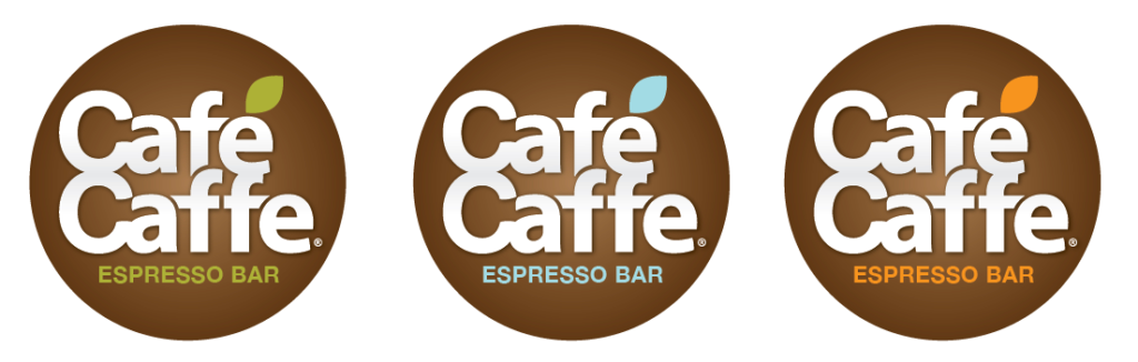
Old Logo
Redesigned Black & White
Redesigned Color
The process
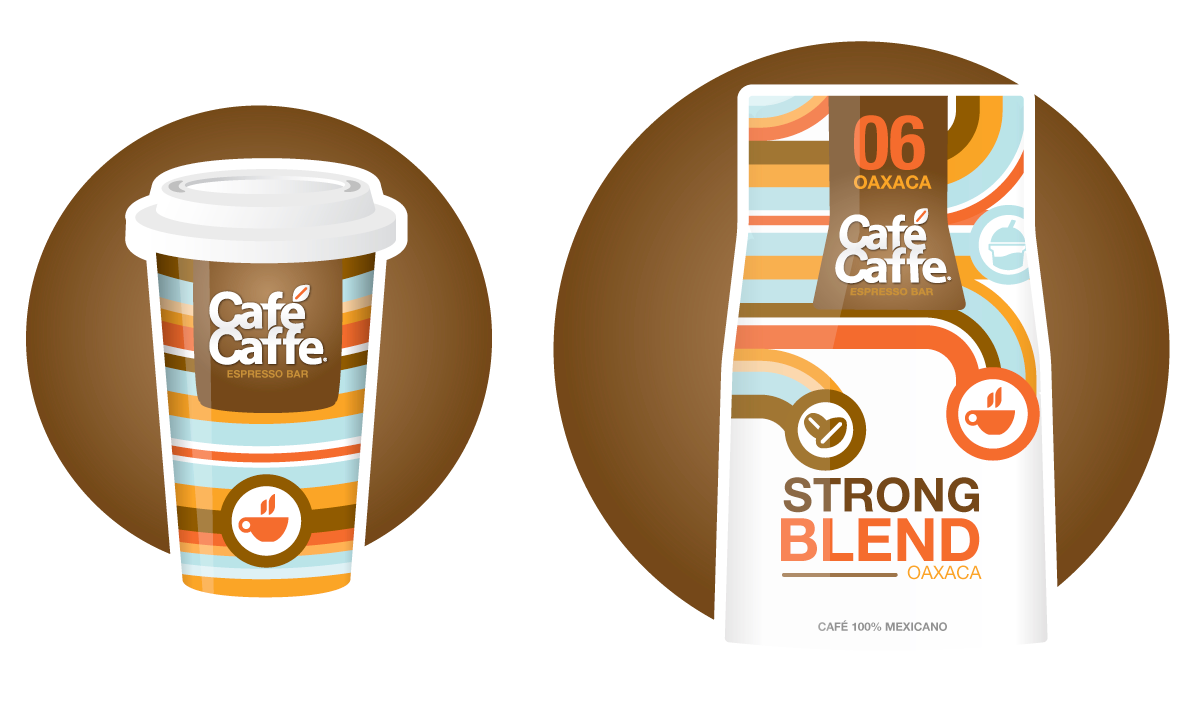
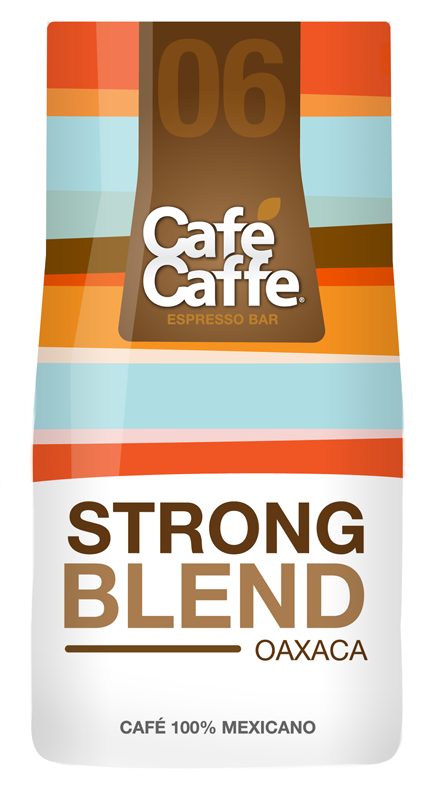
The idea was to bring colors, textures, and feelings you experience in terminal platforms to the brand and coffee shops, so we’re visiting airports, train terminals, and some of the most iconic coffee shops in NYC and Italy, we combined everything and adding train terminal symbology to the mix.
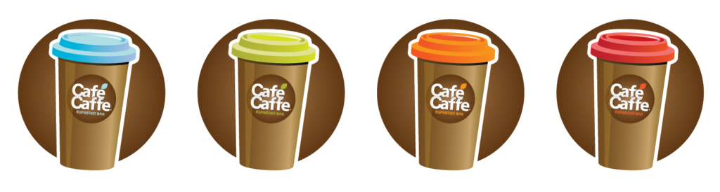
Design
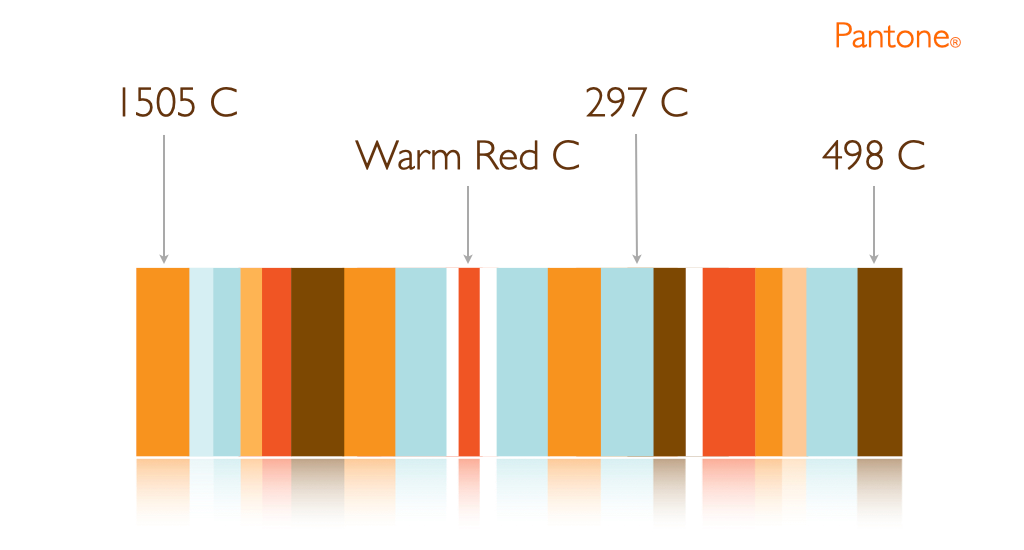
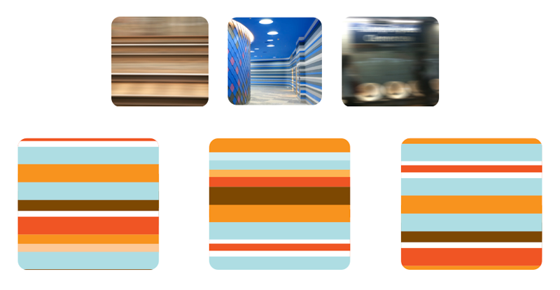
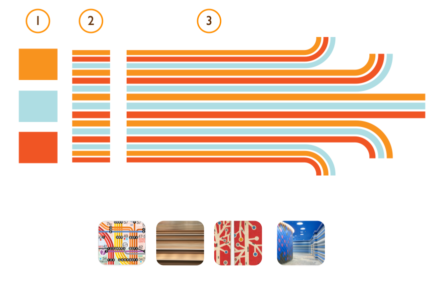
We started working on selecting the color palette, combining fresh coffeeish and chocolateish colors, then we created some textures and patterns based on train movement and terminal platforms.
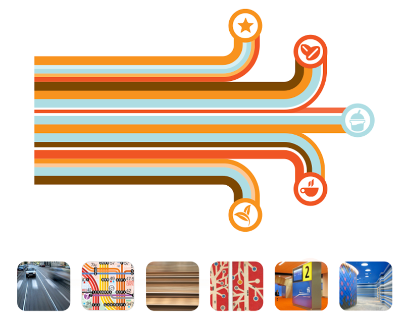
Also, we added iconography which gave the playful touch we’re looking for.
Train Tracks on maps
Capturing the movement of trains in the terminals
Extraction of train line symbology from maps and brochures
Adding train line symbology to the design
“The challenge for OrangeStudio was to refresh the branding by giving their designs a totally new face for the new years to come.”